The San Marino national team have a lot of love around Europe as a plucky underdog, and their gorgeous sky-blue look helps too.
Owing to all that, a stage in the Kit of the Week (KOTW) challenge made sense, so it happened.

The San Marino national team have a lot of love around Europe as a plucky underdog, and their gorgeous sky-blue look helps too.
Owing to all that, a stage in the Kit of the Week (KOTW) challenge made sense, so it happened.
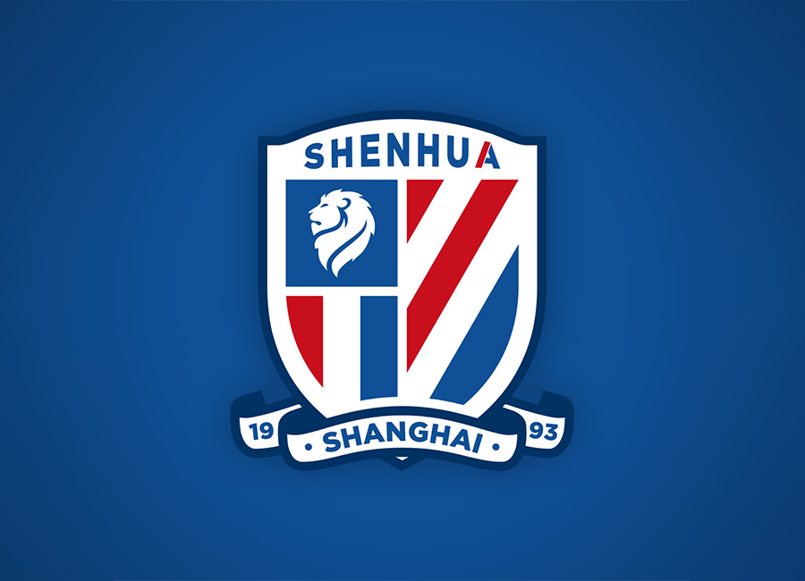
Chinese football has had its ups and downs in recent years but Shanghai Shenhua Football Club (FC), the fantasy client for the 415th stage of the Crest Redesign Competition Weekly (CRCW), are well known globally.
That’ll explain why the stage provoked significant interest, though the quantity of entries was again surpassed by the quality.
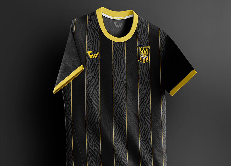
The Club The Strongest stage of the Kit of the Week (KOTW) challenge was exactly as one might expect it to be.
Tiger stripes. Lots and lots of tiger stripes.

Jamaica, for people of a certain age, act as a second team to support in international football.
The Reggae Boyz’ appearance at the France ’98 World Cup in 1998, representing the Jamaica Football Federation (JFF), surprised many - through their qualification and their displays - and they’ve held a place in many hearts ever since, so this stage of the Crest Redesign Competition Weekly (CRCW) excited plenty of members.
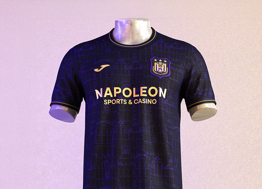
Royal Sporting Club (RSC) Anderlecht is historically the most successful Belgian club, and this naturally called for a Kit of the Week (KOTW) challenge, which it duly received.
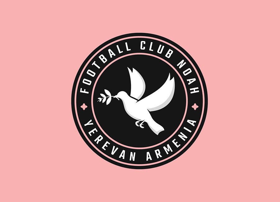
The 413th stage of the Crest Redesign Competition Weekly (CRCW) was focused on Armavir-based Armenian Premier League Football Club (FC) Noah.
Nominally affiliated with the capital of Armenia, Yerevan, the relatively young team have a striking identity which references Noah’s Ark coming to rest in the mountains of Ararat in Genesis, the first book of the Bible, and these are widely represented by nearby (to Armavir and Yerevan) Mount Ararat.