Kit Design Tutorial for BeginnersHere

fsc ea

Manchester 62 FC, the Gibraltar Football League club, might not be known to too many people, but their colours and the stylings of their crest certainly suggest that of their inspiration, European giants Manchester United.

And that was how the 394th stage of the Crest Redesign Competition Weekly played out, and while ONI, for example, retained the inclusion of the Rock of Gibraltar, this had a Red Devil-less Red Devils look on Rabbi’s silver-medal-winning entry and the vote-reflecting podium was completed - by way of Aegon’s third-place-achieving effort and Corinth’s triumphant design - with submissions “United” in effect.

We don’t visit Gautemala all that often, at DesignFootball.com, so it was nice to have Liga Nacional Club Social y Deportivo (CSD) Municipal featured in the 342nd stage of the Kit of the Week (KOTW) challenge.

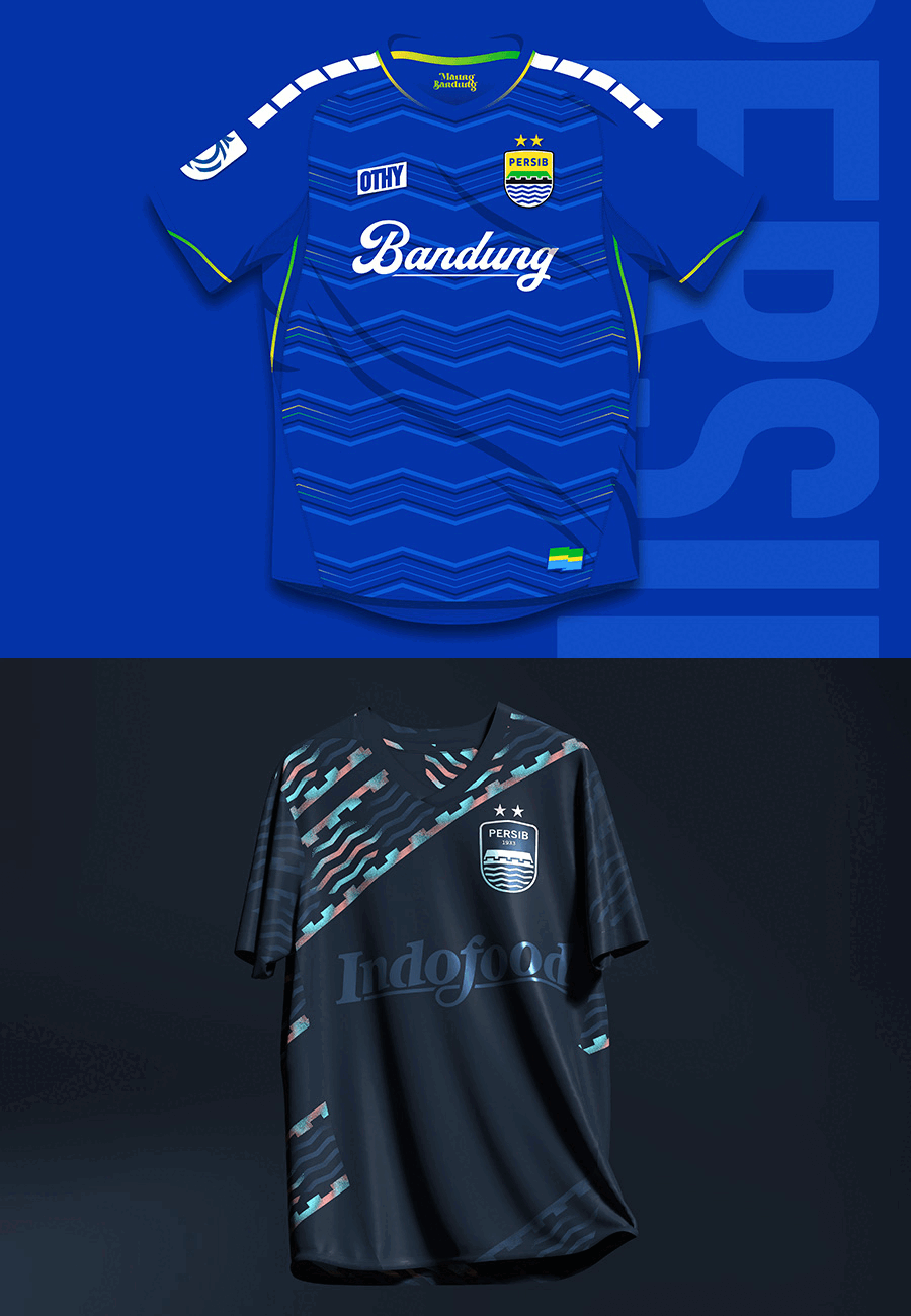
And it was apparently nice for OTHYcreative too, as it resulted in the second stage win in succession for that particular DF member, and the winning design is a lovely Away shirt in a golden-yellow hue with navy-and-red embellishment.

Latest Comments

@RedCardConceptsthanks i never read your comment yet, but no, it was not a good shirt...i have encountered too many problems during the creative process...the bear s face...never mind
atalanta has ever been with nike? i think so....then it was the case for 2 goddesses on same shirt, one was atalanta and the other was nike 
 with sponsor nowso the concept again.....the glass was shattered by the sword cutting through it...so to represent the sword in their crest not by its shape but its effect on ...
non faccio in tempo per lo sponsor...
dont have time for the sponsor...i was too tiredconcept is...a sword, the one in the crest, cuts and shatters glass, therefore the presence of the sword or its cut is ...
5- Luke18783- Giannakakis1- Duksfc