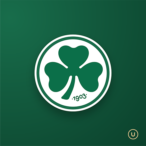
Greuther Fürth

  • Contest: Crest Redesign Cup - Season 4 - [CLOSED]
  • Submitted by: Utskiboo
  • Generic Description: The Greuther Fürth logo is so full of identity, that too much fooling around would be a great shame!So i only went and tweaked the clover, and added the founding year in an organic typography that could work with the clover ☘️I know it's not much of a re-design, but this is how i would solve it.

You must login to post a comment.
You are a guest ( Sign Up ? )
Loading comment... The comment will be refreshed after 00:00.

Be the first to comment.

icon icon-handshak

Let’s Talk!

Got a question, idea, or collaboration in mind? We’d love to hear from you. Whether you’re a designer, brand, or football enthusiast, get in touch to share feedback, discuss a new contest, or learn more about the Design Football website.

Image
Sign Up for Newsletter
Stay updated with the latest insights, tips, and success stories from our team.
Quick Links
Follow Us: