·
10 years ago
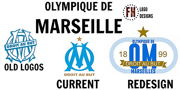
Sorry FH, I know you put a lot of effort into your designs, but you almost always maximize the stuff you want to include just for the sake of it. You [b]don't[/b] have to. Some people might think that minimalistic crest design is just a fad, but I believe that the complete opposite, namely overloading it, makes it terribly clunky and impractical. Case in point, imagine sewing that crest onto a shirt. While the introduction of a running track might be neat in theory, it looks essentially like a striped rectangle with rounded corners and completely - unnecessarily - bloats your design.
The reason why the current OM crest works is that it effectively conserves the old without looking old-fashioned. Your new design overcomplicates the meaning of the brand and makes it practically unrecognisable.
I hope you understand that I mean to constructively criticise. :-) Keep on going, you'll continue to improve.


