 Design Football The Community-Based Home of Concept Football Kit and Crest Designs
 Image 3529 of 4333
Image 3531 of 4333
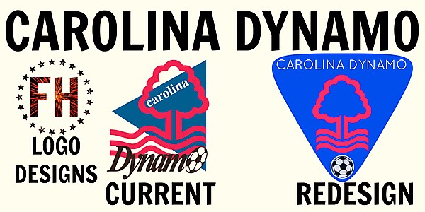
Carolina Dynamo FC New Crest Idea
Image information
- Description
- Feel free to share and edit! Ok, so I was told by one of the most professional crest designers on this website, to take my designes down a notch and exploor some of the "poorer" crests out there. I took the critisism on board and have now decided to try and improve the rather shocking US Premier Development League team: Carolina Dynamo. As you can probably notice, the tree in the logo is made to look very similar to the Nottingham Forest club crest, as the owner of CD is a very passionate supporter of the club. So I have kept this in my crest. Aside from this, I think that the 2 words included in the current crest are out of place and they use not great fonts; So I have placed the words in the same font, and clearly, at the top of the blue triangle, which was also inspired from the current. The one thing that was left to add was the ball, which I think looked almost squeezed in on the current crest. I have not used the ball as the "O" in "Dynamo", but I have placed it neatly at the foot of the crest. Please Enjoy!
- Date
- Friday, 17 October 2014
- Hits
- 4464
- Author
Comments
You are a guest
Loading comment... The comment will be refreshed after 00:00.
Be the first to comment.

