 Design Football The Community-Based Home of Concept Football Kit and Crest Designs
 Image 2896 of 4382
Image 2898 of 4382
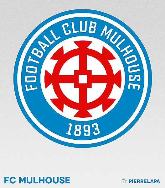
FC Mulhouse - crest redesign
Image information
- Description
- I don't get it how some french clubs have such strong symbols and they mess up with corny gradients and lame typography. Anyway, here's my simple take on FC Mulhouse.
- Date
- Tuesday, 08 August 2017
- Hits
- 4813
- Author
Comments
You are a guest
Loading comment... The comment will be refreshed after 00:00.
Be the first to comment.
