· 10 years ago
This makes no sense whatsoever.
The great thing about the Schalke crest is that, although it might look slightly clunky and outdated, it features the "G" for Gelsenkirchen as a quasi-negative space ornament.
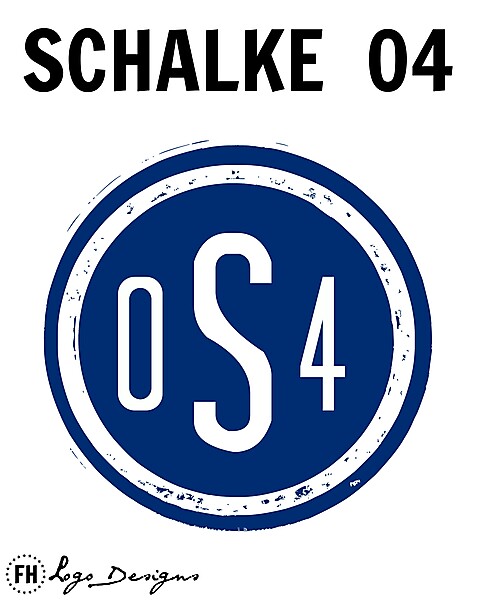
This is just a couple of letters on a dirty blue circle. You're gonna have to rethink.
The great thing about the Schalke crest is that, although it might look slightly clunky and outdated, it features the "G" for Gelsenkirchen as a quasi-negative space ornament.
This is just a couple of letters on a dirty blue circle. You're gonna have to rethink.

