 Design Football The Community-Based Home of Concept Football Kit and Crest Designs
 FC Kolos Kovalivka
Image information
- Description
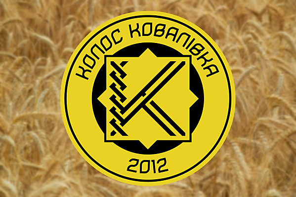
- In my concept I decided to update the look of main symbol of FC Kolos - intersected letters KK (that mean Kolos Kovalivka). The club is named after a spikelet because its owners are bread manufacturers. So the letters K and K intertwin like the wheat seeds in the spikelet creating a more unique symbol than the current one. The 8-shaped star inside of the badge is a symbol of sun. The chosen font Bhofila New is both modern and suitable for the club image as some symbols look like wheat seeds.
- Date
- Thursday, 03 June 2021
- Hits
- 2228
- Author
- Ochoa510


