Image 60 of 63
Image 62 of 63
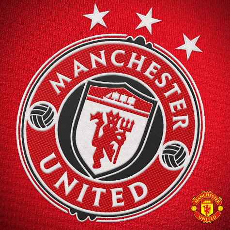
Manchester United Crest Redesign
Image information
- Description
- A modernized redesign of Manchester United\'s crest. Changes include: - Addition of black to the crest, as black has been an unofficial third colour for United for some time now. - Addition of three stars, symbolizing United\'s three European titles. - New modern roundel shape keeps the new logo concise and contained, as well as provides for a number of silhouette options and variants.
- Date
- Thursday, 08 August 2013
- Hits
- 14993
- Author
- Jackeen
 Design Football The Community-Based Home of Concept Football Kit and Crest Designs