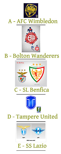
I'm going with the Benfica logo because I think it's probably the most iconic out of the five meaning it's probably the biggest risk to redesign but I think Aco has done it great justice giving a modern look but reprising the characteristics that make it look like a Benfica logo.
 Design Football The Community-Based Home of Concept Football Kit and Crest Designs
 Final 5 Voting
Image information
- Description
UEFA Clubs Logo/Crest
Redesign Competition
Final 5
These are the final five designs as chosen by by our judges Rabbi and his cousin who is a professional graphics designer.
Many designs were worthy of being in the final but only five could be selected, these designs were selected on the basis of how close to tradition they stuck but also offered a totally new unique look at the same time.
Voting closes:- 23:59, Saturday 18th August 2012
Please click on the link to see the logos in their original size as posted by the author.
A - Gunnermike (AFC Wimbledon) - LINK
B - Steevo (Bolton Wanderers) - LINK
C - Aco (SL Benfica) - LINK
D - Jacobeliasson (Tampere United) - LINK
E - kunto (SS Lazio) - LINK
-----------------
Voting Rules
- Post the corresponding letter to the crest/logo design you wish to vote for.
- Remaining five users may vote if they wish but may not vote for their own design.
- One vote per user.
- One vote per IP address, if more than one is found all votes from said IP address will be null and void.
Good luck to all those involved and many thanks to those who entered.- Date
- Thursday, 08 August 2013
- Hits
- 6536
- Author

