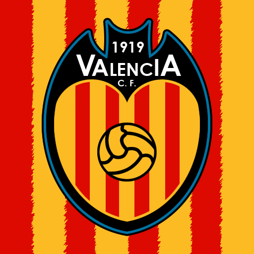
A change in valencia's crest. Instead of using that real-looking (and quite strange) bat from the original crest, I decided to use the bat in a more subtle way: as the shape of the new crest. Inside the bat-shaped crest, I used another shape, this time of a heart (which symbolizes the passion of the supporters for the Valencian community), where I put the red and yellow stripes. Other minor details are the change in the colour of the ball (to a shade of yellow matching the club colours), as well as a blue border. I didn't like the blue background used in the old crest (where the club's name was), but I know the colour is a historical for the club and their supporters, so this was the best way I found in order to put the colour to use. Comments will be much appreciated.
This is awesome! I think you should make the tips of the bat's wings and ears pointed, and part of the heart's curve looks a bit off towards the top. But otherwise, I think ya nailed it. A big improvement on the current logo.