· 5 years ago
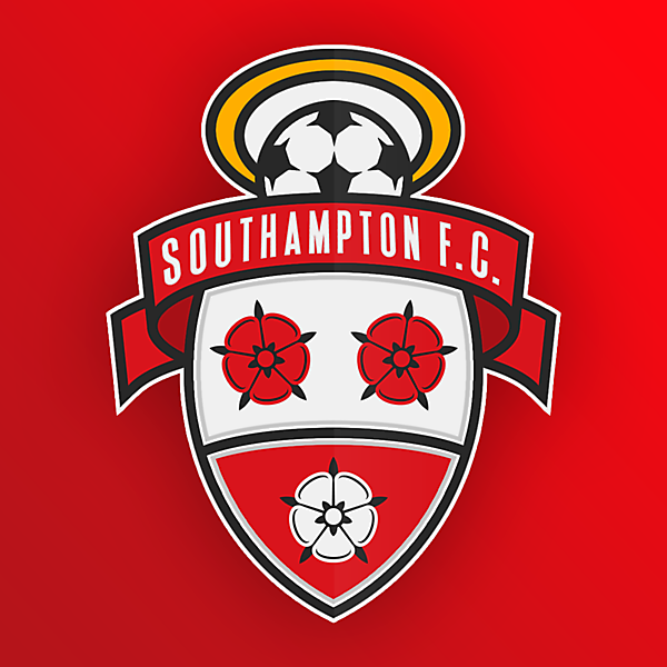
Hello there, a few things I would like to address, as the constructive critique goes : there should be a red amount of color filled between the ball and a gold rim separated with a thin white lines, as it looks odd. I don't really fill a presence of the scarf or ribbon on top of the badge, simply relegate the name on the top part of the badge and make it less messy and complicated for the eye - keep it simple, please. Also, that red figure in the lower part of the badge looks as an open mouth with a snowball and makes the inner part of the badge looks as face with two black decors above it - was that a plan? I do think with some changes it could look as an awesome updated crest. Good job, so far!


