· 10 years ago
Very interesting.
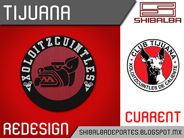
Maybe you should make the letters on the top a little bit smaller and add something in the bottom (looks too empty in contrast with the rest of the crest)
I like it!
Maybe you should make the letters on the top a little bit smaller and add something in the bottom (looks too empty in contrast with the rest of the crest)
I like it!


