 Design Football The Community-Based Home of Concept Football Kit and Crest Designs
 There are at least two fantastic competitions already open - including the Hated/rival team kit design competition and the Atlético Nacional (COL) kit competition - but here's another relatively simple and quick "just for fun"-er.
The North American-based MLS features teams with some particularly striking corporate identities. Some of the crests are fantastic but I was wondering how more traditional and intricate English-style designs would suit the sides. I'm thinking Newcastle United, the old Wigan Athletic crest, or maybe the initialled style of Rangers. It's often claimed that the USA has no history but this is obviously rubbish so what features of each city's past could be incorporated into this sort of crest? How, for example, do you depict a (Los Angeles) Galaxy in intricate, fully embroidered glory? Should the New York Red Bulls have a motto in Latin?
Any current or confirmed future MLS member can be chosen but the team name should not be changed.
As is standard with DF competitions, selected entries will be featured on the DF facebook page and tweeted. Any appropriate designs already uploaded to the DF galleries are both eligible and welcome so please don't hesitate to include them.
The competition will close at 23:59 on Saturday 16th February 2013 and the winner(s) - chosen by me - will be announced shortly afterwards.
Jay29ers.
Update - 17/2/13:
The competition is now closed. Thank you for all the entries.
There were some fantastic efforts, many that would have done each MLS side proud, but only a few really captured the essence of what the competition was about,
I was looking for crests which followed the style of early English/British examples and whilst there were some lovely ideas, brilliantly executed, such as Rey's New England crest (which we had a bit of fun fooling people with on Twitter) and CiaranW90's sojorn into Eastern Europe the spoils have to go to the two designs which would have worked best on an English kit from yesteryear.
CiaranW90's DC United crest took details from both the city's iconography and its status as the capital of the USA, creating something that was unmistakeably American but in a less overtly modern or corporate way than we usually see. Steevo picked a team intrinsically linked to the corporate world but, like Cowboys v Aliens in crest form, mixed the modern content with an olde worlde context to create something which made the New York Red Bulls' identity more palatable.
Congratulations to CiaranW90, Steevo and everyone who made this competition so interesting.
New England Revolution
- Author: Rey
- Hits: 3382
- Category: Major League Soccer (MLS) "Traditional" Crest Competition (closed)
- Comments: 0
Seattle Sounders FC
- Author: raffe
- Hits: 2667
- Category: Major League Soccer (MLS) "Traditional" Crest Competition (closed)
- Comments: 0
Portland Timbers
- Author: Taggo
- Hits: 3618
- Category: Major League Soccer (MLS) "Traditional" Crest Competition (closed)
- Comments: 0

Columbus Crew
- Author: Taggo
- Hits: 2898
- Category: Major League Soccer (MLS) "Traditional" Crest Competition (closed)
- Comments: 0
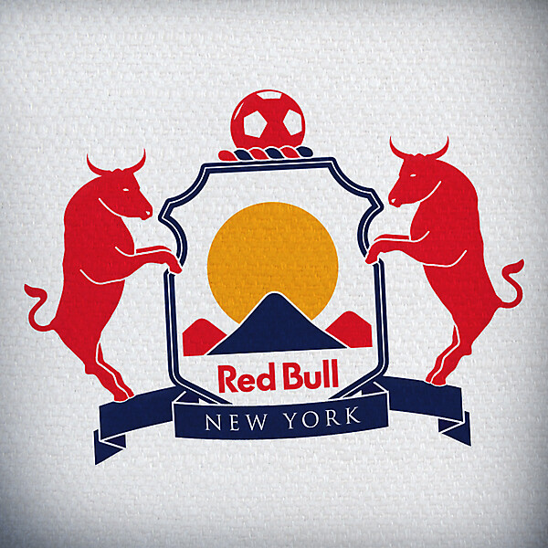
New York Red Bulls
- Author: Steevo
- Hits: 4331
- Category: Major League Soccer (MLS) "Traditional" Crest Competition (closed)
- Comments: 4

Toronto FC
- Author: CiaranW90
- Hits: 2611
- Category: Major League Soccer (MLS) "Traditional" Crest Competition (closed)
- Comments: 0

Philadelphia Union
- Author: Rey
- Hits: 2502
- Category: Major League Soccer (MLS) "Traditional" Crest Competition (closed)
- Comments: 0

Montreal Impact
- Author: CiaranW90
- Hits: 2910
- Category: Major League Soccer (MLS) "Traditional" Crest Competition (closed)
- Comments: 0

LA Galaxy
- Author: Rey
- Hits: 2328
- Category: Major League Soccer (MLS) "Traditional" Crest Competition (closed)
- Comments: 0

New York Red Bull
- Author: Rey
- Hits: 2867
- Category: Major League Soccer (MLS) "Traditional" Crest Competition (closed)
- Comments: 2

Montreal Impact
- Author: Rey
- Hits: 2289
- Category: Major League Soccer (MLS) "Traditional" Crest Competition (closed)
- Comments: 0
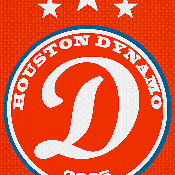
Houston Dynamo
- Author: CiaranW90
- Hits: 3005
- Category: Major League Soccer (MLS) "Traditional" Crest Competition (closed)
- Comments: 0


