Rayo Vallecano de Madrid Crest Redisign

  • Contest: 2) Football Crests Gallery
  • Submitted by: FGeeeer
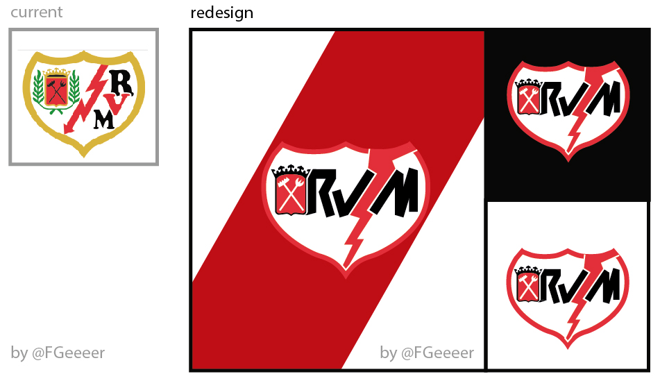
  • Generic Description: Just by:
    -Supressing symbols from the district crest
    -Trying to make the badge look more horizontal, only using 3 colors and drawing all elements from left to right
    -Using straigt shapes for fonts and the lightning, to make the badge look more aggressive.

    HOPE YOU LIKE! DONG FORGET TO VOTE ;)

You must login to post a comment.
You are a guest ( Sign Up ? )
Loading comment... The comment will be refreshed after 00:00.

Be the first to comment.

Image
Sign Up for Newsletter
Stay updated with the latest insights, tips, and success stories from our team.
Quick Links
Follow Us: