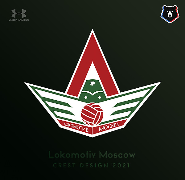
· 4 years ago
The white space above the train makes this red letter an " A " not a cyrillic russian " Л ". That is the issue even with a current team's logo - it looks " A ". In reality the cyrillic russian " Л " has that upper bar and a curve in the letter's shape. Only Lokomotiv from Yaroslavl' ( that is a hockey team ) very cleverly went around the symbol and left it only partially. Anyhow, I think with more work on this - you will eventually achieve the goal. Keep it up.


