· 4 years ago
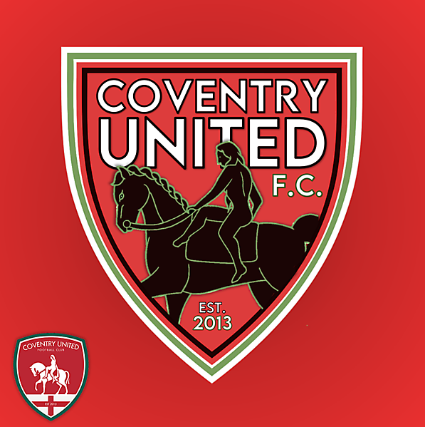
Feels like there are too many outlines for the shield, that and the outlines for the script make this look a bit busy. Do like the idea and the striking effect of the wording and the Godiva statue, less outlines and white instead of green for the statue and this would look pretty cool.


