· 2054 years ago
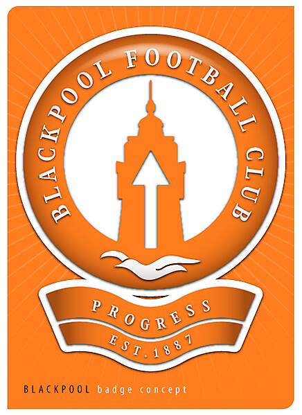
I think it's a good start drawing on the Tower Power logo, i think the arrow on the tower sticks out like a sore thumb though, the great thing about the original is how well it blended in. I also think this suffers in kind of the same way Donnypool's logo does with the large amount of white space that's left empty


