· 10 months ago
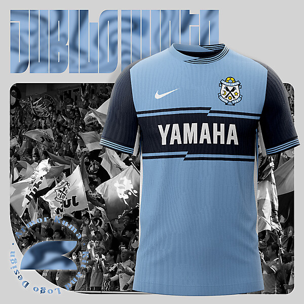
I like the overall look on the jersey , collar and sleeve's trims could have been better off with that zig / zag line that you made on a sponsor with the implementation of that nice shade of gold from the crest . Love the choice of a font on the presentation portion .


