· 5 years ago
 Design Football The Community-Based Home of Concept Football Kit and Crest Designs
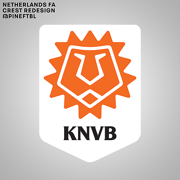
 Netherlands FA Crest Redesign
Image information
- Description
- Taking inspiration from the lion and tulip as the country's symbols and also the recent Iceland logo rebrand, I came up with this redesign. It's a more modern and simplistic take, following the line of the country's logo rebrand (from Holland to NL). Hope you like it :)
- Date
- Monday, 13 July 2020
- Hits
- 4690
- Author
- pineftbl


