
There’s little more exciting on DF than a Unione Calcio (UC) Sampdoria upload, so imagine how heart rates quickened at the news of a Kit of the Week (KOTW) challenge stage dedicated to I Blucerchiati.
It was no less superb than we’d’ve dreamt it. With plenty choosing to push the envelope, it wasn’t entirely for the purists, but certainly forward-looking neutrals - if any kit nerd’s a neutral when it comes to Samp - will have been enchanted by the entries.
Including, but not limited to, a loudly patterned affair from Zaapparel and a sash-based number - a diagonal sash on the Home shirt! - by giannakakis, and derkamartz abandoned the blue of the banding for an otherwise less controversial sash-carrying Away, with the blue present in the collar and Macron “Hero” logos apparently translating as enough respect to deliver a silver medal.
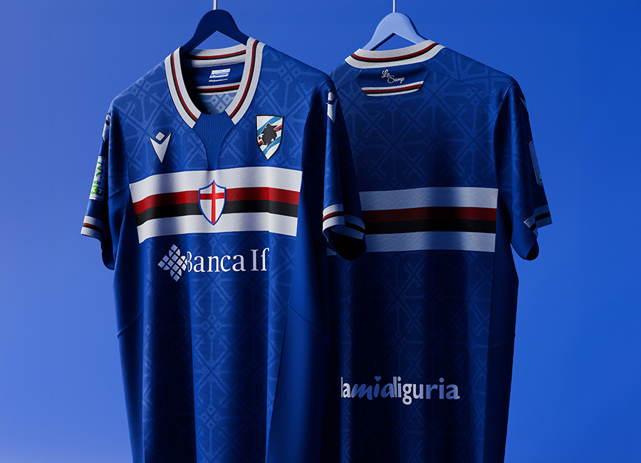
No gong for RedCardConcepts - however merited, we wonder if protests at their interpretation would be more likely in Geno(v)a. That design is certainly unrestrained, so maybe the more understated deviation from the classic look is what secured bronze for Oakleighman and another gold for raffe.
A podium that would please us fans of fantasy football shirts who have high standards when it comes to Samp, with even sampdoriani surely appreciating the offerings for the most part.


https://designfootball.com/design-blog/9-kit-design-news/759-raffe-wins-kit-of-the-week-kotw-356-unione-calcio-uc-sampdoria#sigProId5ee3baba9b


