
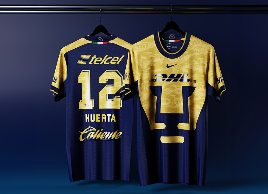
Kit geeks often get excited about Mexico City's Club Universidad Nacional, A.C. - Pumas UNAM - because of the Liga MX side's famous oversized puma-head crest, and the tens of Pumas designs on DF will demonstrate this.
Accordingly, they got a stage of the Kit of the Week (KOTW) challenge, and, unsurprisingly, it was fantastic.
Subversively, some eschewed that delivery of the focal point - we’re looking at you, for instance, rozzimos and giannakakis, though the latter had it stylised in the background - and if RedCardConcepts arguably included it, it was heavily distorted and presented in sash form.
Elsewhere, more utter brilliance, making the eventual voting phase particularly difficult.
The gongs went the way of ONI - bronze-worthy and chef’s-kiss-mwah-worthy - Oakleighman, with a wonderful design that includes a “U” crest in a similar way to OTHYcreative’s superb execution, and, standing above all others, raffe, whose heavy use of gold on a striking interpretation of the famous colours resulted in heavy gold figuratively, and deservedly, being delivered on a ribbon.


