
Sporting Clube de Braga may not have the same clout as Benfica, Porto and Sporting [Clube de Portugal] - indicated by their losing out to the lattermost in the one-word moniker stakes - but they hold their own in Portuguese football and can count plenty of glorious moments in their history.
Nothing like the honour of featuring in a stage of the Kit of the Week (KOTW) challenge, of course, and lots of the big guns got involved when it came to providing Os Arcebispos with shirts for an alternate reality.
There was plenty to tempt, with giannakakis incorporating the gyronny flag of the city of Braga in a subtle tonal manner as one standout act of class, but even this was bested - when it came to the voting - by a podium populated by OTHYcreative, raffe and ONI.
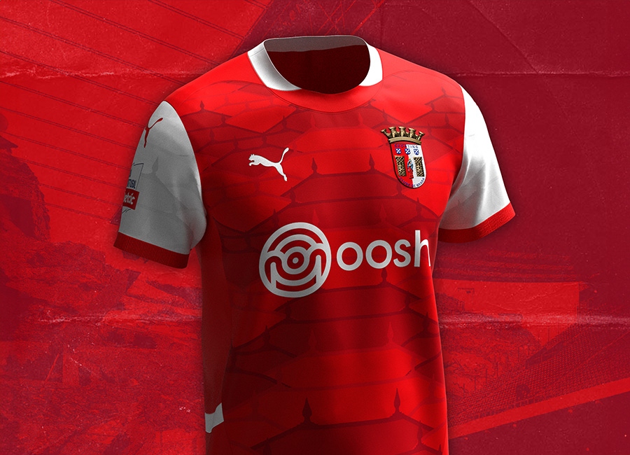
OTHYcreative included a nod to the “Estádio Municipal de Braga” home ground’s design in stylised diagonal stripes, raffe expertly converted the outline of the crest into another sort of stylised stripes and, winning gold, ONI created a thing of beauty based around the Santuário do Bom Jesus do Monte shrine - not the first time a UNESCO World Heritage Site has inspired concept kit greatness on DF!
As much as we may have joked that Arsenal designs could be repurposed for this chapter in the KOTW story, Braguistas actually got options that were undeniably bespoke - not that Os Arsenalistas would have necessarily minded looks intended for the North London giants who inspire their colours.


https://designfootball.com/design-blog/9-kit-design-news/753-oni-wins-kit-of-the-week-kotw-353-sporting-clube-de-braga#sigProIda5bd1717b5

