Ah, it's horrid. We all know it's horrid, from the board, to the designers, to the manufacturers, to the fans, to the innocent bystanders. As much as the club will claim a "Marmite factor", with as many people loving it as hating it, all good sense tells us it's a catastrophe. But, y'know, we've seen it.
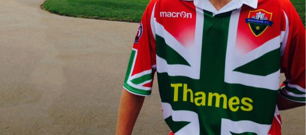
For anyone who has no idea what I'm talking about, earlier this year, the amateur football club Windsor FC launched a new kit, to replace their earlier-released kit this season, and it features Union Flag (Union Jack) stylings, in the colours of the Italian Tricolore flag.
The whole exercise was intended, amongst other things, to promote a local car dealership which specialises in Italian models, and there was even a similarly-decorated vehicle produced. Said car was available in predominantly red or, with the colours reversed as a probable hint of what the club's Away kit will look like, in green. Firms offering solid one-colour resprays are also available, handily.
This all may seem a bit muddled and random, so let me sum up. Football club and car dealership sponsor want to raise profiles, football club and dealership are based in a town which is considered quintessentially British - largely via links to the British monarchy - town is also rumoured to be expecting an influx of Italian migrants in the coming years, club and dealership decides profiles can be raised most easily through vomiting this Anglo-Italian imagery onto an unsuspecting international public via social media. Club and dealership nail it.
And good luck to them, some will say. This lowest common denominator approach to kit design - Et tu, Macron? - is being seen increasingly, with Spanish club La Hoya Lorca and, to a slightly lesser extent, Brazil's Madureira also both putting good taste to one side in favour of "newsworthy" shirts which will be seen far and wide. Liked? That's almost inconsequential when the numbers are added up.
For the survival of smaller clubs, the raising of profiles is crucial. Investment will only come to those who can appear on as many radars as possible, and other local clubs and sports are in competition for the fan base too. In the case of Windsor, the car dealership (I don't name it but it's plastered on the shirts) seems to have taken the lead, and the kit design would most likely be a stipulation in a sponsorship contract so lucrative the club would consider it unrefusable, but shirts sales will be good too. And that's just simple maths.
In the age of social media, blogging (sorry) and news aggregation, it can make more sense to create an ugly kit that will be seen by millions than a beautiful kit that fails to court controversy. Let's assume that an ugly kit will have a conversion rate of 0.1% - that is to say that out of 1000 people who are aware of the shirt's existence, one person will spend his or her hard-earned money in order to own an example. That may sound unspectacular, especially if we compare it with a 5% conversion rate for the classy, restrained shirt of a similarly-profiled club. However, classy and restrained doesn't make for news which will sell advertising space, or tweets which will receive a desired amount of RTs. A red, white and green Union Jack monstrosity, sadly, does.
Taking those assumed conversion rates, Windsor need their shirt to be seen by 50 times as many people as a local league rival's version is - and remember we're assuming the rival's shirt is sartorial perfection - in order to equal the sales. I'd have a guess that 500 times as many people have seen Windsor's kit than can even name one of their league rivals, let alone have any idea what colours any of them wear.
The danger is that we regard this occurrence as an accident. That it was a naïve publicity stunt that went viral, entirely catching the club off-guard. Don't fall for it. The kit's look itself may be calamitous - a hodgepodge of political connotations ranging from the "British" bowler hats combined with the Union Jack on launch day bringing to mind Orange Order marches, contrasting with the choice of colouring suggesting the Basque Ikurrin, all housed in a baggily cut, sublimated horrorshow the like of which has been rarely seen since the mid-nineties - but the balance of garishness and reining in is calculated to a T.
Because, like the conversely stylish Team GB kit of the London 2012 Olympic Games, the golden rule of not rendering the Union Jack in its familiar form is adhered to. Where Stella McCartney went all-blue, Windsor have gone red, white and green. Like a Union Jack-styled kit design equivalent of going full r*tard, no one would leave the flag in its unambiguous original state, because of its obvious implications of imperialism, extreme nationalism, jingoistic xenophobia and racism. Windsor FC and their partners knew exactly what they were doing - creating a talking point without risking the negative PR of a vociferous backlash.
Depression will inevitably set in. A similar logic is applied across much of modern life with, for example, the once noble Independent newspaper now employing a truly odious social media professional who elects to share an intelligent piece on the (im)morality of meat-eating with a photograph of flame-grilled dogs (view at your own risk, but note the contrast with the header image used in the article proper, and the warning that accompanies the gallery where the Facebook image is taken from). Shock and ridicule, rather than simply being nothing to be scared of, are now routinely embraced, perhaps even fellated, in the ongoing quest for exposure, reach and hits. While writing this article I noticed the EastEnders Facebook page sharing a story about one of their actresses filming a courtroom scene, with a caption beginning "Watch the exclusive ‘Drama in Court’ video featuring Charlie Brooks...". A quick Google of those keywords will suggest that particular social media guru is exploiting namesakery to seek traffic via hoodwinking. Just add it to the list of dark arts.
But, as always, our concern should be centred on football design, and it is suffering as a result of this modern fashion. A club as big as Liverpool FC should not have the "reach v conversion rate" calculation utilised in its kit development, but this season's Third and - now supposedly legendary thanks to a victory at Old Trafford - Away kits both smack of exactly that. Rather than being an occasional nuisance, the practice is more likely to become the norm, certainly in the lower levels of domestic football, with each team looking to outdo each other in the infliction of horrified awe.
So how to stop the rot? We plead with the designers to curtail the approach and challenge them to create masterpieces which spread like wildfire on Facebook and Twitter for the right reasons. It's happened before with, to name but two, Southampton in their 125th anniversary Home shirt and with the Athletic Bilbao 2011-12 Away - the latter managing to hint at an apt flag design and combine green, white and red to wonderful effect - so it can happen again. Let us fight the good fight.
Written by Jay (follow on Twitter).
Keep up to date with news from the world of football design by following @designfootball on Twitter and Liking the DesignFootball.com Facebook Page.