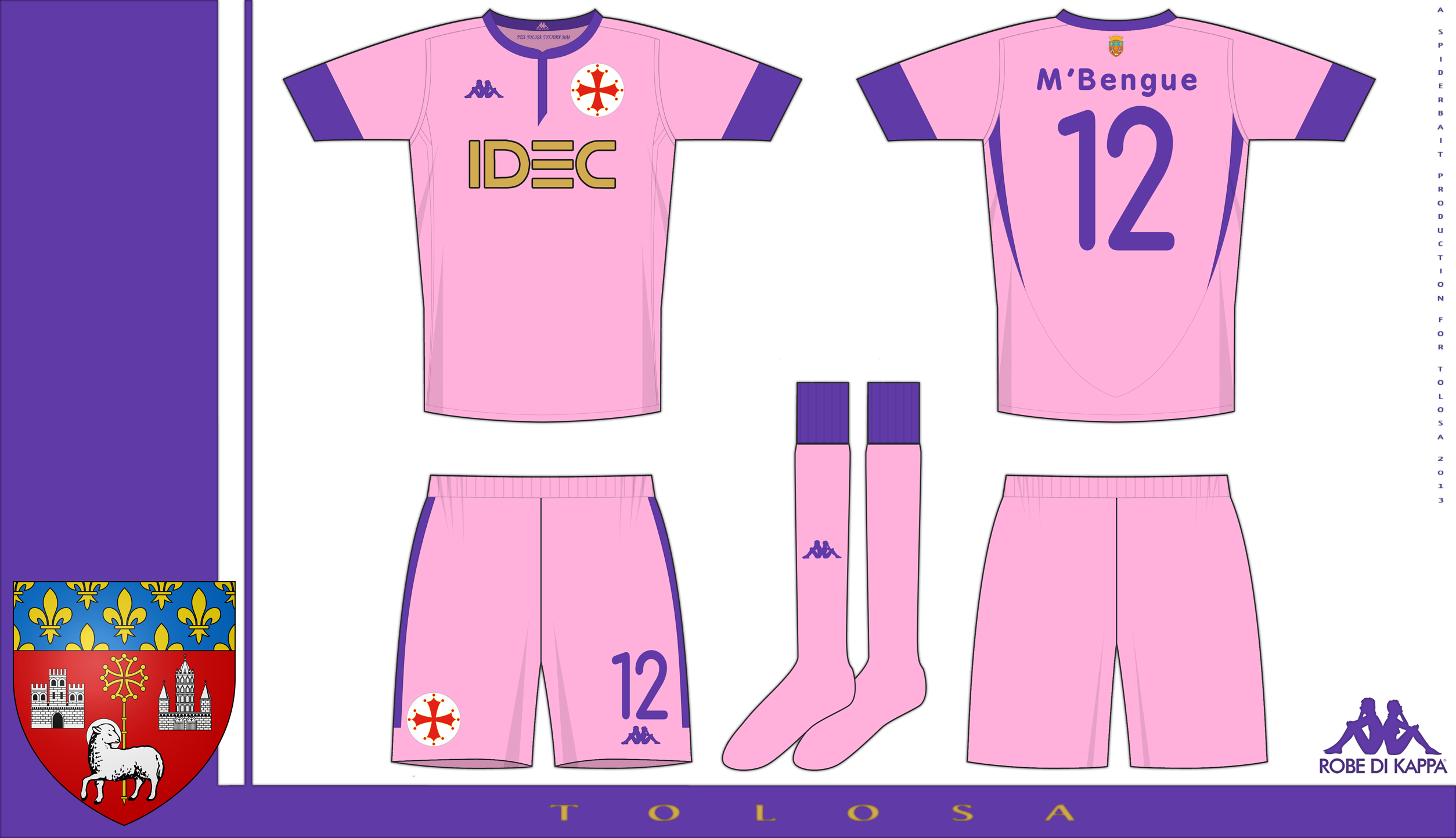
Home and change for Toulouse, the Home is in violet with gold trim, the change is in pink with violet trim. The colours reflect one the nicknames of Toulouse, the city of roses. Features on both kits. Cross of Toulouse as the main crest on the shorts and shirt, a symbol of Toulouse. Coat of arms of Toulouse on back of shirt below collar. The motto of Toulouse, in Occitan, PER TOLOSA TOTJORN MAI (Always more for Toulouse. Please click on the Zoom to see in full detail. Comments would be cool.
I really don't like either of your Tolouse kits, one the home there's one too many colours that don't go together and on this there's two too many. Also the template looks nothing like a Kappa style although you have got the collar down to their styling on the home shirt.
The home was originally meant to be the change kit, I made a mostly white home with violet stripes and to make the number and sponsor stick out on the stripes, I used a black border. On the home, Violet and gold go together and the colours "pop", the same way orange and mid blue do.
As for it not looking like a Kappa template, so? Kappa have been rehashing the same style (tight fitting shirts, lots of logos on sleeves, variations on crew necks) for over a decade now, perhaps its time for something different.
Compare the Italy shirt from euro 2000 with the kits Kappa had been making in the years 1996-1999. The contrast there is far, far greater than between this and the kappa templates that have been used in recent years.
The violet and gold is fine, like you say it 'pops', but then you introduce the white for the logos, then red which is a part of the main focus of the shirt, the crest, and also the heavy black outline, as a whole I just think it's too much, and then you introduce the rosé colour here too, it could be simplified.
The point I was trying to make was that I don't see the point in using a brand if you aren't also going to be using it's generally accepted brand aesthetics. If you were looking to do a re-brand, fine, but it wasn't made apparent that was the case.
To be fair, the colour of the Toulouse cross is red with a gold outline, and it is hard to make shirts with just 3 or 4 colours on them. Toulouse is a case in point.
I did actually use the brand aesthetics when I first started with the template design, I took the V neck combined with a crew collar style of the current Kappa template, and used a similar style for the sleeves, and for the side panels, I took inspiration from the Cerro Porteno kit Kappa did a while back, and from several other styles. But the template evolved as I tried different things (a side effect of using PS, and adding and the swapping of layers and parts). It did start off closer to the current Kappa style, then evolved into the style here.
Only having one kappa logo on the shirt, and changing the collar to a mandarin style, is probably the biggest factor in not looking like a kappa style shirt.
Yeah you have a point, maybe the white crest background could be eliminated and have the cross standalone and then change the white kappa logo to gold to tie in with both of them, I still stand by my belief that so many colours in such a fashion looks messy.
You're right that is probably a big factor stopping this looking like a Kappa style, but I also think the sharp angles in the template doesn't help it either as Kappa generally tends to be a lot more rounded.