 Design Football The Community-Based Home of Concept Football Kit and Crest Designs
 Redhill4
Image information
- Description
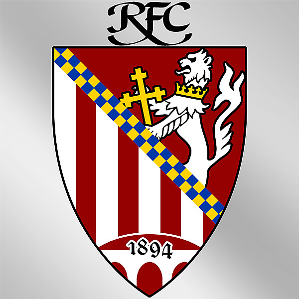
- In a slightly different direction that the previous ones, a slightly spanish feel maybe? This one contains the classic colours of red and white in the form of stripes, and the lion from the previous crest (redrawn by Rabbi and used with his permission), separated by the Blue and Gold checks of William de Warrenne, First Earl of Surrey, of which the shield shape is also taken. At the bottom of the crest Are the three arches and the clubs founding date. The (beautiful) lettering of RFC appears at the top, as I feel it should be retained in some shape or form in the next crest.
- Date
- Thursday, 08 August 2013
- Hits
- 2580
- Author
- julian121


