· 2054 years ago
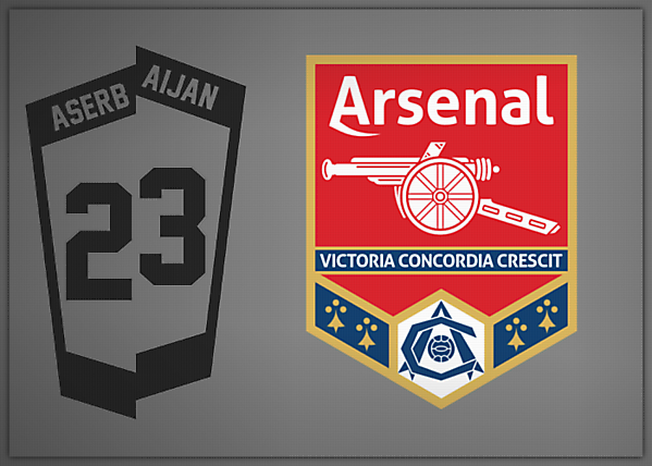
I like this. Cannon's the right way round, the ermines have returned, the art deco crest is featured nicely, along with the motto, and the colours are spot on. The dash under the A does look odd though. I'-) like to see it in the classic gothic style font, not sure if it'-) work, or maybe just the A in that font. Good work though.


