 Design Football The Community-Based Home of Concept Football Kit and Crest Designs
 Bristol City
Image information
- Description
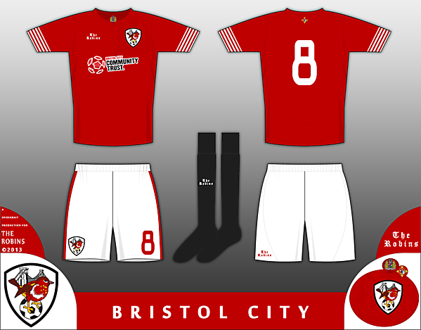
- Home kit concept for Bristol City. The most significant part of the shirt is the crest, which marks the return of the Robin Crest that was worn when the side played in the top level of English football from 1976-1980, and is still the most popular among City fans, with a campaign to bring it back (or at least for a new crest with the Robin at the Forefront) The kit itself takes inspiration from the kits of 1976-81 (Robin Crest), the 1971-76 kit (the cuffs) and from the 1906-07 kit, in which they achived their highest ever finish in English football, runners up in the top flight (Black socks and non contrasting collar. The current crest is watermarked around the robin crest on the shirt, and the seal of Bristol, with the ship and castle motif, and the four fleur de lis, representing the four cardinal points. The current crest, based on the Bristol coat of arms is on the inside of the shirt, with the club name swapped for the motto of the city of Bristol, Virtute et Industria. Please click on the zoom button to see in full detail. Comments would be cool
- Date
- Wednesday, 16 October 2013
- Hits
- 3755
- Author
- Spider


