 Design Football The Community-Based Home of Concept Football Kit and Crest Designs
 Image 4750 of 4958
Image 4752 of 4958
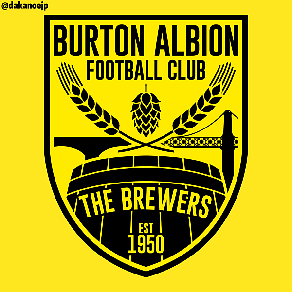
Burton Albion Crest
Image information
- Description
- Never make me do this again, Bower. Anyway, The shield shape is lifted from the old civic arms. The hops, barley and barrel are all symbols depicting Burton's brewing industry, and were all present on the 1993-94 crest. Alongside those are two of Burton's iconic bridges, Burton Bridge and Ferry Bridge. "Burton Albion Football Club" appears at the top while "The Brewers" is relegated to the bottom of the crest as only having a nickname on the crest is rather an unusual feature. And the fat bloke kicking a football is gone. That's the most important bit. Screw history, it just looks daft.
- Date
- Wednesday, 27 April 2016
- Hits
- 6979
- Author
Comments
You are a guest
Loading comment... The comment will be refreshed after 00:00.
Be the first to comment.

