· 2054 years ago
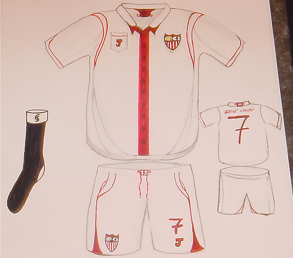
This is my take on a new Sevilla FC kit, it was hand drawn 100%, and taken with a digital camera.
This is my entry into the competition to design a Sevilla kit.
It has been designed both as a utilitarian garment and also to look good both on and off the field. I chose the button up design for the reasons that it would keep players and fans cool, and would feel good to wear, it would be made out of the same material as the new England shirt (nice light Cotton) and it would look good both worn baggy and tight on the players. The shirt would be available in a non button up version as well, but I’ve shown the button-up version, a design that was popular in South America in the 40s and the 50s. The main colour is a vibrant red instead of the shade that has been used in recent years, for the reason that it gives a more aggressive feel to the shirt, especially when used as the main colour on the central stripe. The Buttons are shaped like a yarn (madeja) as shown on the flag of Sevilla which is also placed on the back of the collar.
No madeja do - No me ha dejado - “It [Sevilla] has not abandoned me.”
The other shade of red on the shirt is a lighter red, this is used for the seams and the trim on the sleeves. The “-)aggers” on the shirt give a dynamic feel, and the panels are cut to the hem of the shirt to give the same feel for the shirt. The shirt has a pocket on which the J logo for Joma is placed (The logo is just a single letter)
The back of the shirt, except for the flag on the collar is plain; this is to contrast with the front of the shirt
The shorts have pockets In them – these will be removed and sewn up for the “Match” Versions. The shorts are baggy and have mesh on them to improve ventilation for the players.
The socks are black, as I believe that the kit looks distinctive with the black socks, sets Sevilla apart, and the socks have white turnovers with the SFC crest on them from the Sevilla FC Escudo.


