 Design Football The Community-Based Home of Concept Football Kit and Crest Designs
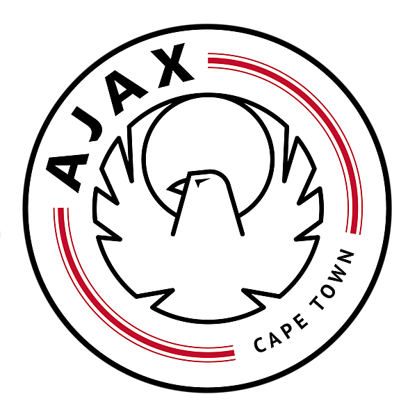
 AJAX CAPE TOWN REDESIGN
Image information
- Description
- Very little to pull on here. Avoiding cultural and racist stereotypes that seem like a logical pull, here I shrank the J slightly to account for a change for graphic, using a redrawn version of the eagle from the original 'Cape Town Spurs' logo – associating the past with the future.
- Date
- Sunday, 17 November 2019
- Hits
- 3721
- Author
- elfisho


