Home
Latest Designs
Community
Upload
Community Stream
Your Profile
Your Uploads
Login Page
Create Account
Galleries
All Designs Gallery
Football Kits Gallery
Football Crest Gallery
Football Boot Gallery
Logo Design Gallery
Loud Kits Gallery
Football Art Gallery
Challenges
About
Upload Terms
Feedback
Planned Updates
Blog
About us
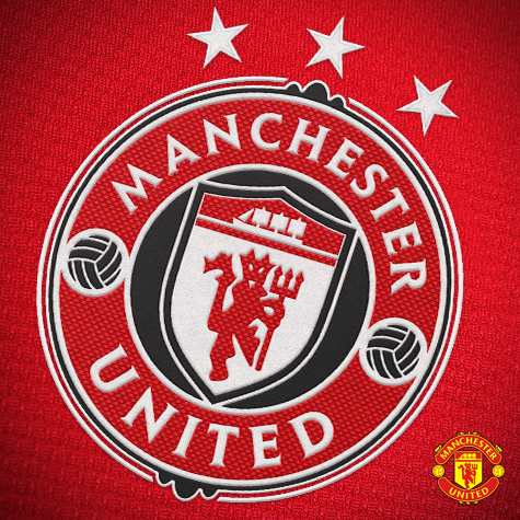
Manchester United Crest Redesign
Contest:
UEFA Clubs Logo Crest Redesign Competition (closed)
Submitted by:
Jackeen
Generic Description:
A modernized redesign of Manchester United\'s crest. Changes include:
- Addition of black to the crest, as black has been an unofficial third colour for United for some time now.
- Addition of three stars, symbolizing United\'s three European titles.
- New modern roundel shape keeps the new logo concise and contained, as well as provides for a number of silhouette options and variants.
0
Previous
Next
Comment
RSS
Login
Register
Oldest
Best
Popular
Newest
Oldest
Collapse All
Expand All
You must login to post a comment.
You are a guest
(
Sign Up ?
)
Login Now
Loading comment...
The comment will be refreshed after
00:00
.
Be the first to comment.
Latest Challenges
KOTW 442 - GLASGOW SELECT 2026
CRCW 488 - TORINO
RALSOdesign Wins KOTW 441 - ACF FIORENTINA 100TH ANNIVERSARY
R0nald0_dsgns Wins CRCW 487 - WALES NT
OTHYcreative Wins KOTW 440 - NOTTINGHAM FOREST
Aegon Wins CRCW 486 - AC MILAN
Fayed wins KOTW 439 - HAITI NT
Aegon wins CRCW 485 - SC BRAGA
Sign Up for Newsletter
Stay updated with the latest insights, tips, and success stories from our team.
Quick Links
Football Shirt Culture
Football Shirt Collector
Blog
Contact
Follow Us:
x
facebook
Instagram
Home
Latest Designs
Community
Upload
Community Stream
Your Profile
Your Uploads
Login Page
Create Account
Galleries
All Designs Gallery
Football Kits Gallery
Football Crest Gallery
Football Boot Gallery
Logo Design Gallery
Loud Kits Gallery
Football Art Gallery
Challenges
About
Upload Terms
Feedback
Planned Updates
Blog
About us


You are a guest ( Sign Up ? )
Be the first to comment.