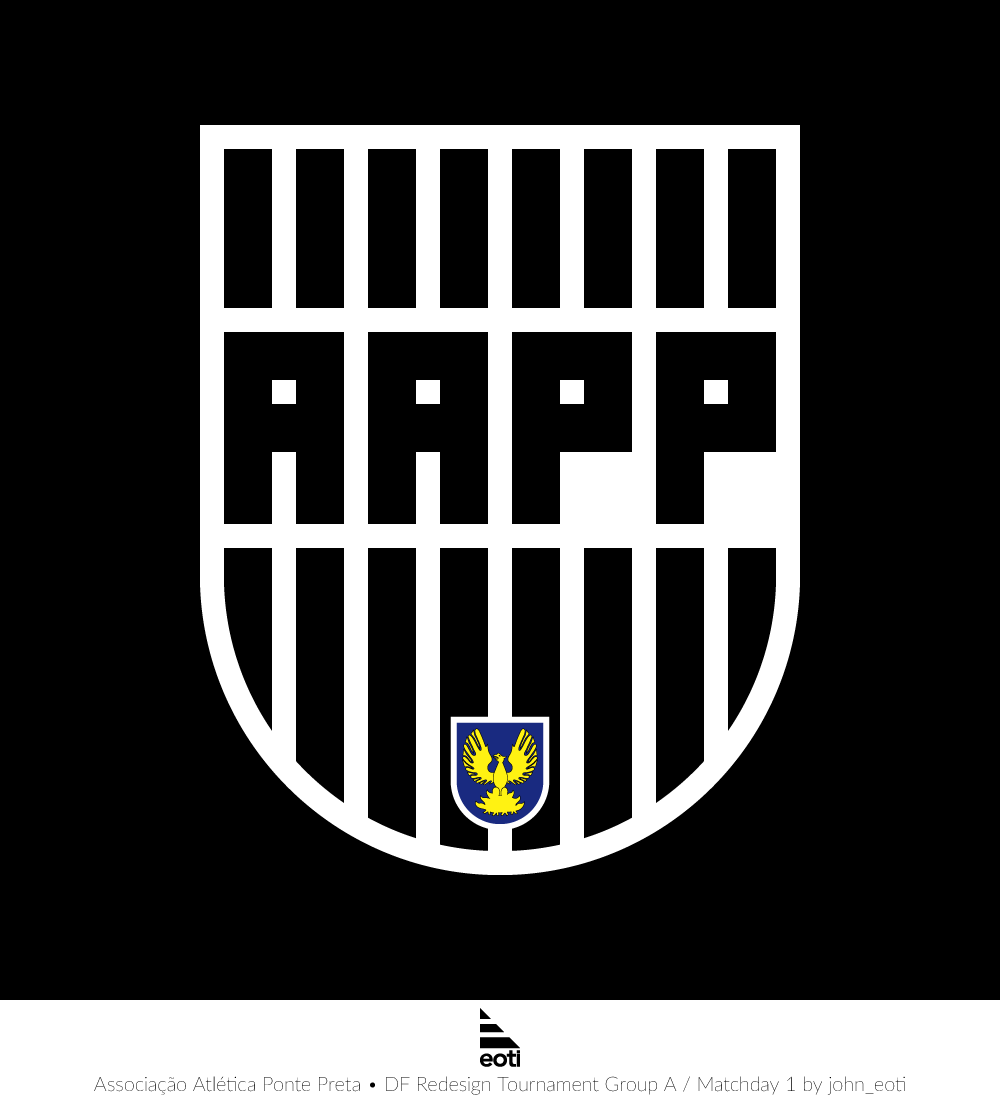
Generic Description: Ah, this was a tough one. I'm usually having a hard time redesigning sort of dichromatic, pattern-y crests, especially when the club doesn't have a lot of other symbolism going in which could be implemented. This goes for AAPP as well. Their only trademark, so to speak, is their black-and-white stripes and the letters. That's it. They haven't had any other elements in or near their crest in more than one hundred years of history.
So I decided to go retro, give it a bit of an eight-bit look. Make the stripes geometrically align with the letters. And voilá. Oh, and I also put the Campinas (their hometown) phoenix on there just to give it a splash of colour, although traditionalists will most likely not be in agreement. Hope you like.


You are a guest ( Sign Up ? )
Be the first to comment.