Image 3190 of 4225
Image 3192 of 4225
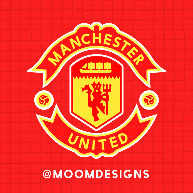
Manchester United Rebranding
Image information
- Description
- Heres a sketch I did to simplify the manchester united logo. tried to keep the musts and cut away the shading and the strokes that werent needed. Bit out of my element so let me know what you think!!! warning: the text is a little bit off i know, the program I had up while sketching this cant wrap text in a circle. Please do not use without permission. Property of Moomdesigns / Joshua Wilson @Moomdesigns on twitter and instagram. Moomdesigns.com thanks for looking guys
- Date
- Wednesday, 04 November 2015
- Hits
- 5430
- Author
- moom