 Design Football The Community-Based Home of Concept Football Kit and Crest Designs
 Image 3181 of 4869
Image 3183 of 4869
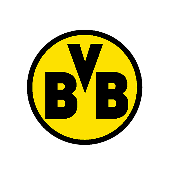
Borussia Dortmund
Image information
- Description
- In my opinion, the best crests are the simpler ones. They get their point across quickly, without wasting time with unnecessary details and embellishments. That’s why I can’t help but fall in love with that glorified railroad crossing sign Borussia Dortmund uses as its logo. My concept keeps everything more/less the way it is, I just changed the font of the lettering, removed the date, and simplified the outlining of the roundel.
- Date
- Monday, 06 January 2020
- Hits
- 3410
- Author
Comments
You are a guest
Loading comment... The comment will be refreshed after 00:00.
Be the first to comment.

