the stripes are supposed to be embossed and have that shiny look. Sort of like the current bayern home kit with the Bavarian pattern pressed in. cheers!
Unfortunately, the rules say the kit has to be made by Puma, because this is one of the best (if not the best) kits so far. The gradient stripes give it an unique style (and be unique with those three stripes on every adidas kit is definetely a tough job). Great design!
First off the bat, thanks for entering, and I wish the other two guys had entered, I was really looking forward to your designs and ideas.
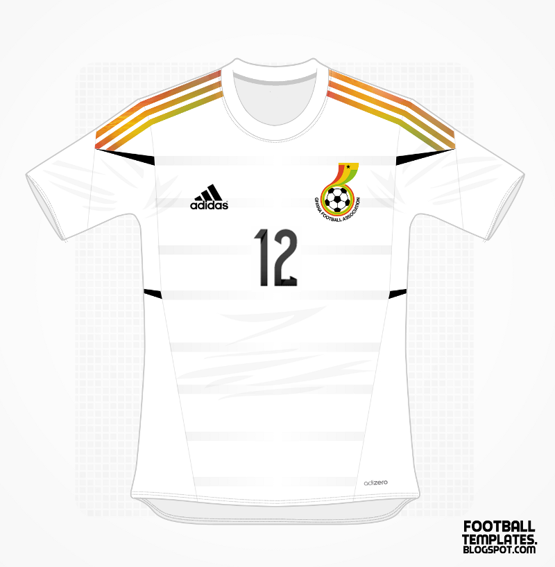
On the shirt, if it had one less stripe on the sleeve and a puma logo, this would have been a good entry. I put the rules about puma logos as I wanted people to try and better the puma design for the 2014 world cup, and have a constant with that logo.
On the design, if it was an adidas comp, this would have been a nice design, the three stripes look great and the ones on the front look good too.
Putting the Ghana FA logo on there instead of the Black Star lets it down, the Black Star is the Symbol of Ghana, and its lost on the FA logo. Having it large and proud on the shirt looks far better.
Having said that, this is a nice shirt. And thanks for entering, its just a shame I can't consider this shirt for the prize.
This is probably one of the best, it isn't valid for the comp but you could enter it into the World Cup kits comp, could be in with a shout on tht one!